Most SaaS teams treat demo video placement as an afterthought. They spend days producing a polished walkthrough, then drop it on a product page and call it done. The video exists. The box is checked. But two months later, conversion numbers haven't moved, and nobody can explain why.
The problem isn't the video. It's where it lives. The same 90-second demo can perform completely differently depending on where it appears in the buyer's journey. A video that converts well on a pricing page may do nothing on a homepage. A clip that works brilliantly in outbound email would be wasted sitting below the fold on a features page.
Placement isn't a detail. It's the strategy. Research shows video on a landing page can boost conversions by up to 80 to 86 percent, but that lift only materialises when the video matches the intent of the visitor viewing it. This guide maps the five highest-converting locations for SaaS demo videos, explains why each one works, and calls out the placement mistakes that quietly kill performance.
Why Placement Determines Conversion
SaaS websites are not a single audience. A visitor on your homepage may be hearing about you for the first time. A visitor on your pricing page is comparing you against two competitors and has twenty minutes to make a decision. A prospect who clicked a link in a cold email is sceptical and in a hurry.
The average SaaS landing page converts at 2.35 percent. The top 25 percent of SaaS landing pages convert at 11.6 percent or higher. That gap doesn't come from better copy or a different colour scheme. It comes from understanding visitor intent at each stage and serving the right content to match it. A demo video is one of the most powerful intent-matching tools available, but only when it's placed where the buyer's question is loudest.
The five locations below are ranked by the strength of intent signal they carry, from broadest to most specific. An AI demo agent makes it practical to produce a tailored video for each location, because generation takes under 10 minutes per video rather than an afternoon per recording session.
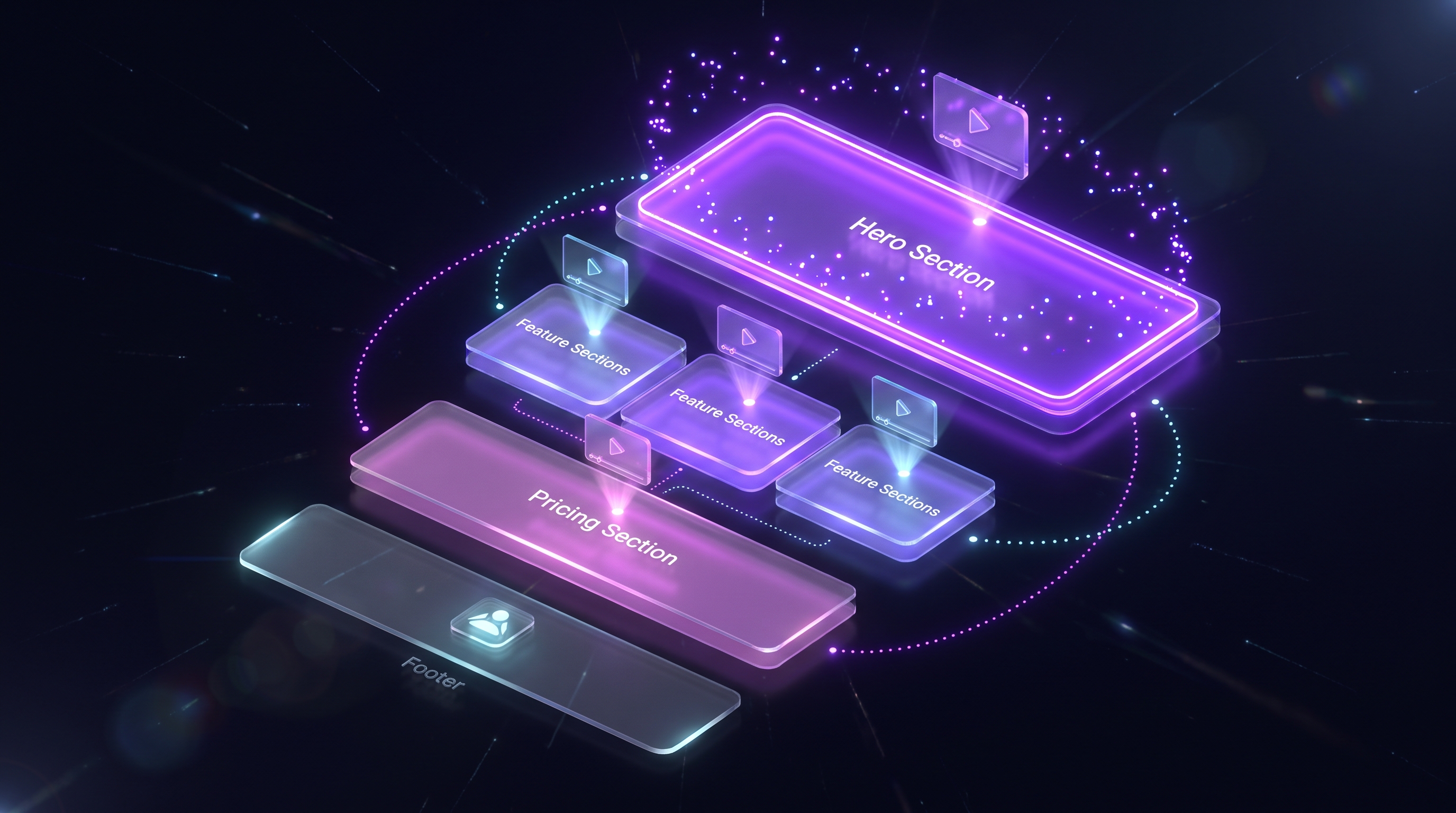
1. Homepage Hero
The homepage hero is your highest-traffic placement. It's where most first-time visitors land, and where the vast majority of them decide within seconds whether to stay or leave. A well-executed demo video in the hero communicates what your product does before a visitor has read a single line of copy.
The data is consistent: video in a hero section reduces bounce rates and increases time on page. Eyeview research puts the conversion uplift at up to 86 percent for pages with video versus those without. That figure varies by product category and audience, but the directional signal is clear. Visitors process video faster than text, especially when they're evaluating an unfamiliar product in a competitive category.
How to execute the homepage hero correctly
Use muted autoplay. The video should begin playing immediately when the page loads, without sound. This acts as an animated thumbnail rather than an intrusive interruption. Give users a clear play button so they can opt into the full audio experience if they want it.
Keep the video between 60 and 90 seconds. That's enough time to establish the problem, show the product resolving it, and land a clear value proposition. Longer videos lose most viewers before the payoff. If your product genuinely requires more context, use a short teaser in the hero and link to a longer walkthrough on a dedicated demo page.
Place the video near the primary CTA. Proximity matters. A video embedded three scrolls below the "Start free trial" button does not support the CTA; it competes with it. The video and the CTA should be visible at the same time.
The homepage hero is the only placement where your video competes with zero prior context. The visitor knows nothing about you yet. Show them the product working before you ask them to believe any claim about it.
What kills homepage hero performance
Autoplay with sound sends bounce rates up. So does a video that starts with a logo animation or a talking-head introduction: each delays the moment the product appears on screen. Every second before the product is visible is a second the visitor might leave.
Eighty-five percent of videos are watched on mute on mobile. If your hero video relies on voiceover to communicate anything important, it fails silently for the majority of your mobile visitors. Captions are not optional.
2. Pricing Page
Visitors on your pricing page carry the highest purchase intent of anyone on your site. They've already passed through awareness and consideration. They're asking a specific question: is this worth what they're charging? A demo video on the pricing page addresses that question directly, at the exact moment it's being asked.
Demo request pages should convert at 1.5 to 4 percent. Pricing pages with supporting video consistently sit at the higher end of that range because the video reduces the uncertainty that makes visitors hesitate. Seeing the product deliver its core value removes the "but does it actually work?" objection before it needs to be raised in a sales call.
What the pricing page video should do
This video has a different job than the homepage hero. It doesn't need to explain what the product is. By the pricing page, the visitor already knows. What it needs to do is answer the "is it worth it?" question. That means showing a complete, realistic workflow rather than a highlight reel. The visitor needs to see the full arc: input, process, output.
Keep it under two minutes. Show the workflow that most directly justifies the price. If your product saves ten hours a week, show the ten-hour task being completed in under a minute. If your product eliminates a painful manual process, show the painful process disappearing. The video should make the pricing look like a bargain, not a cost.
Place it above the pricing tiers, not below. Visitors scan pricing pages quickly. A video buried below three pricing cards gets ignored. Put the video first, let it make the case, then present the pricing as the natural next step.
A note on persona-specific pricing videos
Personalised demos by persona generate 63 percent higher completion rates than generic walkthroughs. If you have multiple buyer personas landing on your pricing page, a single generic video will underserve all of them. An AI-generated video for each persona, focused on the features that matter to that specific role, will outperform a one-size-fits-all approach. This is where the speed of AI demo video generators pays off most directly: producing three persona variants costs the same as producing one when generation is automated.
3. Cold Outreach Email
Cold email is the placement most teams overlook entirely, and it's where a well-positioned demo video creates the clearest competitive advantage. Most cold outreach is text only. A video thumbnail in an otherwise text-based email is a genuine pattern interrupt.
B2B buyers who watch product videos before a purchase decision are significantly more likely to convert than those who don't. Cold email gives you direct access to those prospects before they've discovered your competitors. A 60-second demo that shows the recipient's exact problem being solved, addressed to their specific role and use case, converts at a fundamentally different rate than a text description of the same outcome.
How to include a video in cold email without breaking deliverability
You cannot embed a video file directly in an email. Doing so dramatically increases the chance of landing in spam. The correct approach is an animated GIF thumbnail that links to a hosted video page. The GIF previews the first few seconds of the video to drive a click, while the full video lives on a page that tracks views.
For a full breakdown of this approach, including thumbnail design, link placement, and tracking setup, see the guide on demo videos in cold email outreach.
What the cold outreach video should show
Keep it under 90 seconds. Open with the problem, not the product. Show the prospect something they recognise from their own work life within the first ten seconds. Cut to the product solving it. End with a single, specific CTA. No product tour. No feature list. One problem, one solution, one ask.
Lead capture within the first 10 to 20 percent of a video, which in email context means a CTA that appears immediately after the click, produces measurably better results than CTAs placed at the end. When a prospect clicks your GIF thumbnail and lands on your video page, do not make them watch the whole thing before they see a way to act.
4. G2 and Capterra Listings
G2 and Capterra are where active buyers compare tools. A visitor on your G2 profile is not browsing. They're evaluating. They've already defined their requirements, shortlisted their options, and arrived at your profile to find a reason to include or exclude you from their final decision. That's the most qualified traffic you'll ever get from a third-party source.
Most companies treat their G2 profile as a review aggregator and nothing more. They fill in the basic fields, add a logo, and wait for reviews to accumulate. Adding a demo video to your G2 and Capterra listings puts your product directly in front of buyers who are already ready to decide, at the moment they're comparing you against your competitors. For a complete strategy on this, the guide on demo videos on G2 and Capterra listings covers optimisation in detail.
What the G2 listing video should show
This video needs to differentiate, not introduce. By the time a buyer reaches your G2 profile, they understand the product category. What they don't know is why you specifically are the better choice. Show the features your competitors don't have. Show the workflow your competitors make painful but you make simple. Name the specific use cases your product handles best.
Keep it to 90 seconds or under. G2 visitors are in comparison mode and have multiple profiles open simultaneously. A two-minute video competes with their attention span in a way that a 75-second video does not. Get to the differentiating value within the first 15 seconds or you lose the viewer.
5. Onboarding Flow
The onboarding flow is the placement that most directly affects revenue retention, yet it's the one teams invest in last. A new user who doesn't activate in the first session is unlikely to return. A short demo video at the right moment in the onboarding flow can be the difference between a user who activates and a user who churns.
Interactive product walkthroughs consistently outperform static onboarding in activation rate comparisons, with some teams reporting 20 to 30 percent gains. Video in onboarding produces a similar effect because it removes the "what am I supposed to do next?" friction that stops new users from completing their first workflow.
How to use demo videos in onboarding
Show the exact flow the new user needs to complete in their first session, not a general product tour. If the activation moment for your product is connecting a data source, show that connection being made in the video. If it's creating a first project, show that. Specificity is the difference between a video the user skips and one they follow step by step.
Keep onboarding videos under two minutes. New users don't have the patience for longer content when they're trying to accomplish something. The video should feel like a shortcut, not a training course.
One practical approach is to embed the video directly in the first onboarding modal or in-app tooltip, so it appears at the exact moment the user needs it. A video that surfaces only on a help page will be found by a fraction of the users who need it. A video embedded in the flow itself reaches all of them. For implementation details, the guide on embedding Demosmith demos on your website covers placement options for in-app contexts.
The support load reduction case
The business case for onboarding videos goes beyond activation. Every user who can answer their own question from a video is a support ticket that never gets submitted. Teams that invest in video onboarding tend to see measurable drops in first-week support volume. That's a cost saving that compounds as the user base grows.
What Not to Do: Four Placement Mistakes That Kill Performance
Knowing where to place a demo video is only half the picture. The other half is knowing what to avoid. These four mistakes account for most of the cases where teams produce a good video and see no measurable impact.
Burying the video below the fold
Play rates drop sharply when a video is more than two scrolls below the top of the page. Most visitors never scroll far enough to find it. If a video is worth producing, it's worth placing where visitors will actually see it. On a homepage, that means above the fold. On a pricing page, that means above the pricing tiers.
Autoplay with sound
Autoplay with audio increases bounce rates consistently. Users don't expect a website to suddenly start talking at them. Muted autoplay is fine; it draws the eye without demanding attention. Sound-on autoplay feels like an ambush.
Using the same video in every location
A homepage hero video and a pricing page video are answering different questions for different visitors at different stages of the buyer journey. A single video cannot serve either job well. The homepage visitor needs context; the pricing visitor needs justification. Using the same video for each misses the intent of each placement.
The production cost objection to creating multiple videos disappears when generation is automated. A fresh video per placement isn't a production challenge when each one takes under 10 minutes to generate.
No captions
Eighty-five percent of video is watched on mute on mobile. A video without captions loses most of its mobile audience before the message lands. Captions are not an accessibility feature to add later; they're a baseline requirement for any video that needs to perform.
One Video Is Not Enough
The implicit assumption in most SaaS demo strategies is that a single video serves all placements. It doesn't. A homepage hero video, a pricing page video, a cold outreach clip, a G2 profile video, and an onboarding walkthrough are five distinct content assets with five distinct jobs. They require different lengths, different opening hooks, different levels of assumed knowledge, and different CTAs.
The reason most teams produce one video is that producing five manually would take days. AI demo generation changes that equation. When a polished, branded, narrated demo video can be generated in under 10 minutes from a URL and a plain-English description of the flow, producing placement-specific variants is no longer a production challenge. It becomes a strategic decision: what story does each placement need to tell?
The teams winning on demo video aren't making better videos. They're making more of them, in the right places, for the right buyers, at the right moments.
Demosmith's AI voiceover covers 29 languages, and its brand kit applies automatically to every generated video, which means the same placement strategy that works for an English-speaking market can be replicated for French, German, or Japanese audiences without a separate production workflow. The five placements above are a repeatable system, not a one-time project.
Conclusion: Match the Video to the Moment
Demo video placement isn't a creative choice. It's a strategic one. The same video that lifts conversions in one context can sit unwatched in another. The data on this is consistent: video works, but placement determines whether it works for you.
The five highest-converting locations for SaaS demo videos are the homepage hero (broadest audience, first impression), the pricing page (highest purchase intent), cold outreach email (direct access to qualified prospects), G2 and Capterra listings (active comparison shoppers), and the onboarding flow (activation and retention). Each requires a different video with a different angle, length, and CTA.
The good news is that producing five placement-specific videos is no longer a days-long undertaking. With AI demo generation, it's an afternoon of planning followed by an hour of generation time. The constraint isn't production capacity; it's knowing what each placement needs and building accordingly.
Key Takeaways
- Video placement determines conversion more than video quality. The same video performs completely differently depending on where it lives in the buyer journey.
- The homepage hero is the highest-traffic placement. Use muted autoplay, keep it under 90 seconds, and place it near the primary CTA.
- The pricing page carries the highest purchase intent. The video there should answer "is it worth it?" not "what is this?".
- Cold email requires a GIF thumbnail linking to a hosted video. Embedding video directly harms deliverability.
- G2 and Capterra listings reach active comparison shoppers. The video should differentiate, not introduce.
- Onboarding videos reduce support load and increase activation by showing new users the exact flow they need to complete in their first session.
- One video cannot serve all five placements. Each requires a different angle, length, and CTA. AI demo generation makes producing placement-specific variants practical at scale.